Why I Needed to Redesign Seattle’s City Flag

The Current Seattle Flag
When I say I needed to redesign Seattle’s city flag, I mean it. I needed to do this, not because I thought I could make money from this project, but instead because I believe so deeply in the future of Seattle, in American cities broadly, and in the power of how we represent ourselves influences who we become — it was eating me up to do nothing.
Currently, the Seattle city flag is an overly complicated design that few citizens know about and even fewer fly.

Originally adopted on July 16th 1990, the design by David Wright was created for the occasion of Seattle hosting the Goodwill Games; the little talked about Cold War era Olympic-style contest was created in reaction to political controversy of the Olympics after protests erupted regarding the invasion of Afghanistan by the Soviet Union. This led the United States and other Western allies to boycott the 1980 Olympic games held in Moscow and the Soviet Union and their allies to boycott the 1984 games held in Los Angeles as part of the retaliatory response.
The official resolution to adopt this flag stated: “The official flag shall be of the design depicted in Figure 1. The colors shall be white and teal blue/green (the color of Puget Sound at dusk).”

In the resolution to adopt this flag, the council proclaimed that the Goodwill games and the supporting Goodwill Arts Festival “…reaffirm the City’s belief that the future well-being, if not survival of all citizens, is dependent upon our recognition of common bonds and shared responsibilities; with the games we celebrate, improved dialogue and goodwill throughout the world”.
This history introduced the Seattle moniker “City of Goodwill”. (Though I, and most others, prefer the 1982 tourism campaign dubbing Seattle the Emerald City)
However, this design, while beautifully sentimental, breaks many principles that establish a good flag design, defined by NAVA — the North American Vexillological Association, the official body in the United States dedicated to the study of flags.
Those principles, popularized by Ted Kaye in “Good Flag, Bad Flag, How to Design a Great Flag”, are:
- Keep it Simple — the flag should be so simple that a child can draw it from memory
- Use Meaningful Symbolism — The flag’s images, colors, or patterns should relate to what it symbolizes
- Use 2–3 Basic Colors — Limit the number of colors on the flag to three, which contrast well and come from the standard color set
- No Lettering or Seals — Never use writing of any kind or an organization’s seal
- Be Distinctive or Be Related — Avoid duplicating other flags, but use similarities to show connections
The current design utilizes just 2 colors which are symbolic — great(!), everything else we miss on.
Previous re-design solicitations held by the Seattle Times and the Stranger have asked citizens to redesign the Seattle City flag. It is beautiful to see this energy around civic pride, but these designs also miss the mark to me. Take for example the disqualified Orca flag who was accused of stuffing the ballot box for their design:

I appreciate the whimsy associated with this flag, but its representation of an Orca’s face feels too literal to represent a city as diverse in experience as Seattle.
Instead, I think we need a far simpler response. The current design of the Seattle city flag is good, and by making a few small adjustments to bring the design in alignment with NAVA’s specifications we can create a design that truly sings:
Seattle’s future — our imagery, our identity

Here, I have removed the unnecessary language (using words to describe a symbol generally misses the point of a symbol — not to mention that English is not everyone’s primary language) and seal of the city. There is absolutely a place for city seals, but on a dynamic flag in the wind being viewed from a distance, the fine details get lost.
The removal of the seal is an important concept to recognize — I am conscious of the seal of the city and its depiction of Chief Seattle , and how some community members may have concerns about the removal of his image from this flag design. I recognize and validate this concern and want to share my perspective.
When it comes to iconography and cultural symbols, Americans have a long and troubled history of appropriating indigenous culture in a variety of ways, one of the most visually common practices of this is to use the likeness of indigenous people to identify a colonialist system. This appropriation in my mind is a gross misuse of privilege when there is continually disproportionate funding and support for indigenous communities. This is unacceptable. Through an anti-racist perspective, it is my intention with this design to move past the visual appropriations and, instead, adopt an inclusive narrative of our community’s history — one that weaves a symbolic and equally important history of Duwamish and Suquamish peoples with those who have since inhabited the area (of course, pending the consent for the representation of indigenous history). The representation would not end with tribal history, but elevate BIPOC contributions broadly to create the Seattle we know and love today.
On the flag, there are seven interwoven Puget Sound waves connected to one another symbolizing “the future well-being, if not survival of all citizens, is dependent upon our recognition of common bonds and shared responsibilities” from the original council resolution, or more briefly, our common bonds. For these seven waves, I would love for the city to assign each wave an inclusive historical narrative via crowd sourcing from our citizens meaningful moments in our history that we want to help guide us into the future. The waves and field are teal, to represent the color of Puget Sound at dusk and white, symbolizing the peaks of the mountains wrapping around the city. This new flag combines the symbolism from the original flag intended for the Goodwill Games, makes adjustments to reflect our evolution in flag design principles, and creates an anti-racist narrative to ensure all people of Seattle feel represented.
If the city requested this design for official use, I would give it to them for free.
—
Design matters — It tells stories about who we are and who we want to be.
I was originally inspired by Roman Mars’ TED talk, “Why city flags may be the worst-designed thing you’ve never noticed” — In it he describes cities like Chicago and Amsterdam whose city flags are flown with pride. If you’ve never watched Roman Mars’ TED talk, I highly recommend it — it perfectly represents my energy for this. The Chicago example is really what sparks me. The amount of love the city has for this piece of design is truly outstanding, from tattoos to t-shirts you’ll see the city bursting with this symbol. Chicago’s Flag Is a Much Bigger Deal Than Any Other City’s Flag — Chicago Magazine.
I believe Seattle is on the cusp of becoming an absolutely world class city. With this opportunity, I think about how we are going to present ourselves and the story we want to tell the world.
—
I envision this flag as an opportunity to bring us all together. For far too long I feel like we have relied on the Space Needle and the Seahawks to be the predominant symbols of the city. While I deeply love both these institutions, I do not believe that they are inclusive enough to represent such a diverse cross-section that is our shared community.
I imagine our other cultural institutions in the city when I think about what it means to bring us all together. Consider for example the Seahawks, they may not be representative of our entire region and all the people that call it home, but they’re an absolutely fascinating cultural case study.

Throughout the entire region you can feel the Seahawks’ influence. Construction workers have Seahawks stickers on their hardhats, restaurants adorn 12 flags, businesses put banners on their buildings, Russel Wilson had a line of frozen meals at QFC . I come from North Dakota, I never had anything like this when I was growing up — so to come here and see how it has buy-in from such a diverse collection of citizens, it is something else. I compare the Seahawks to European cities and the way they celebrate soccer — I don’t know if we always analyze our culture from an outsider’s perspective like when we juxtapose it to European soccer; when one does this, you can feel how deep it permeates the region.
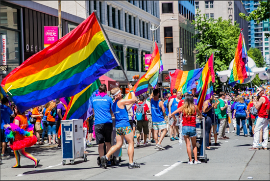
In a non-sports example, June and the celebration of LGBTQ+ Pride is another excellent case study. Right now, all throughout the city you can see pride flags flown from apartment buildings, offices, and in non-Covid times we would be packing our streets with major parades and celebration. This is a time to celebrate oneself, friends, co-workers, and family members — but most importantly find and build community. More than 10% of Seattle residents identify as LGBTQ+ — on par with San Francisco | The Seattle Times

It means something to be from somewhere — you can know your history, find community, have something in relation with a stranger. To me, that is beautiful, it is one of the most precious things in life.
Both those examples are what I think about when I envision what it means to bring us together as a city. It’s about having something in common, it’s about shared passions, it’s about naming something you love and celebrating it — together.
In Seattle and the broader region, we just weathered one of the most traumatic global events of our lifetimes together. We made it through as a community — and we did it better than almost anywhere else in the United States:
Seattle’s Virus Success Shows What Could Have Been — The New York Times (nytimes.com)
Seattle Is First Major U.S. City To Vaccinate 70% Of Eligible Population — Here’s The Cities That Could Be Next (forbes.com)
As we come out of this horrific time in American history, we have an opportunity to honor those we’ve lost, empathize deeply with those who have faced catastrophe and oppression, and reflect on our common bonds with one another.
I think people in our region know it means something to be from Seattle. It is time we celebrate our home and give it the honor and love it deserves — symbols do this, flags do this.
For more content regarding the Seattle city flag, follow us on Instagram @SeattleCity Flag
If you’d like to join the grassroots movement to with a flag of your own, you can find my Etsy account here: Seattle City Flag Etsy.
All profits from the flag sales go to Mary’s Place, a Seattle non-profit that provides safe, inclusive shelter and services that support women, children and families on their journey out of homelessness.

